

Modern organizations rely heavily on data to guide strategic and operational decisions. Sales performance, customer behavior, operational efficiency, and marketing results all generate valuable insights.
However, when these insights are presented as spreadsheets or long tables of numbers, it can be difficult for decision-makers to quickly understand what the data actually means.
This is where data visualization becomes essential.
Data visualization uses charts, graphs, dashboards, and other visual tools to transform complex data into insights that can be understood at a glance. This shows the patterns, trends, and opportunities that might’ve remained hidden.
Below are some of the most common and effective data visualizations that every business report should include.
Bar Charts
Bar charts display information using rectangular bars that represent different values. The length or height of each bar shows how one value compares to others.
Bar charts are most commonly used for comparing performance across categories.
For example, businesses may use bar charts to compare:
- Sales across different products
- Revenue across regions
- Marketing campaign performance
- Productivity across departments
Because the visual comparison is immediate, bar charts help decision-makers quickly identify which categories are performing well and which require improvement.
ALSO READ: What Is Data Visualisation? Why Does It Matter in Business Reports
Line Charts
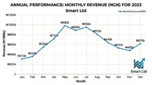
Line charts are especially useful for showing how data changes over time. A line chart connects individual data points with a continuous line, making it easy to see upward or downward trends.
Most business reports use line charts to display metrics such as:
- Monthly revenue
- Quarterly profits
- Website traffic
- Customer growth
- Sales trends
By analyzing these patterns over weeks, months, or years, leaders can quickly identify changes that may not be obvious in a table of numbers.
For instance, a line chart may reveal seasonal sales patterns, showing that revenue increases during certain months and declines during others. It can also highlight steady growth in customer acquisition or a gradual decline in engagement.
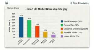
Pie Charts
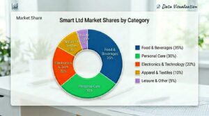
Pie charts are used to illustrate proportions within a whole. Each slice of the pie represents a portion of the total, making it easy to understand how different segments contribute to the overall picture.
Pie charts provide a simple and effective way to display distributions such as:
- Revenue contribution by product line
- Market share by region
- Budget allocation across departments
- Customer segments within a target market
A larger slice immediately signals that a particular segment represents a significant share of the total. This allows leaders to quickly identify where most revenue, expenses, or customers are concentrated.
ALSO READ: The Future of Business is Data-Driven
Dashboards
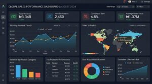
Dashboards combine multiple visualizations into a single, unified view, providing a high-level summary of business performance.
Instead of reviewing multiple charts separately, dashboards present the most important insights in one place.
Many organizations design dashboards to track Key Performance Indicators (KPIs) such as:
- Revenue growth
- Profit margins
- Customer acquisition rates
- Operational efficiency
- Sales performance
These metrics are often updated automatically, enabling real-time or near-real-time performance monitoring.
Because dashboards provide a clear overview of business health, they are particularly useful during leadership meetings, performance reviews, and strategic planning sessions.
Heat Maps
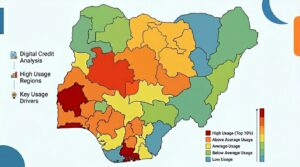
Heat maps use color intensity to represent differences in data values. Typically, darker or more intense colors represent higher values, while lighter colors represent lower values.
This visual approach makes it easier to detect patterns, concentrations, and anomalies within large datasets.
For example, businesses often use heat maps to analyze:
- Regional sales performance
- Customer engagement across digital platforms
- Website user behavior
- Operational performance across locations
A regional sales heat map, for instance, might highlight areas where sales are strongest and where they are weaker. By simply observing the color variations, leaders can quickly identify trends and areas that require attention.
ALSO READ: Importance of Data Insights to Business Growth
Turning Data into Actionable Insights
Effective business reports do more than present numbers, they help leaders understand what those numbers mean.
Data visualization plays a crucial role in making this possible. Each visualization serves a unique purpose, from comparing performance and tracking trends to showing proportions and identifying patterns.
By transforming raw data into clear visual representations, organizations can communicate insights more effectively, support better decision-making, and drive stronger business outcomes.
At Keyen DataPulse Ltd, we help organizations design intelligent reporting systems and dashboards that turn complex data into actionable insights.
The true value of data lies not just in collecting it, but in making it easy to understand and act on.
If you have any questions not covered above, get in touch with Keyen Data Expert via:
WhatsApp: (+234) 7066544798
Email: hello@keyendatapulse.ng